User experience (UX) design is crucial for creating websites that are both usable and enjoyable for people.
Several principles based on psychological and design studies can help improve your site’s usability.
Aesthetic-Usability Effect
This law suggests that users tend to perceive aesthetically pleasing designs as easier to use. Visual appearance influences perceived usability and can increase user satisfaction.
Ensure your site is not only functional but also visually appealing. Studies even indicate that users are generally more forgiving of design errors if the product looks good.

Example: An e-commerce site with an attractive design, pleasant colors, and readable typography is perceived as easier to navigate and use.
A well-crafted design can make users feel more comfortable and confident making purchases, even if the functionality is the same as a less aesthetic site.
Jakob’s Law
Jakob’s Law suggests that users prefer your site to work the same way as other sites they already know.
Adopt familiar and consistent design patterns so users can navigate and use your site without a steep learning curve.
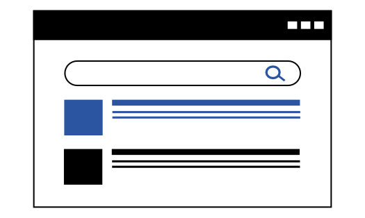
Example: Everyone is used to Google. If you implement a search engine on your site, design it to be intuitive based on common user expectations.
Doherty Threshold
The Doherty Threshold states that productivity increases when a system and its user interact at a pace that allows the user to keep progressing without interruptions.
Keep load times and system responses under 400 milliseconds to optimize user interaction.
Example: “Buy Now” and “Add to Cart” buttons on an online store are designed large and positioned near product images and descriptions. This reduces the time users need to click, making conversions easier.
Fitts’ Law
Fitts’ Law establishes that the time required to move a pointer (e.g., a mouse cursor) to a target (e.g., a button) depends on both the distance to the target and the target’s size.
Targets that are larger and closer are easier and faster to select.
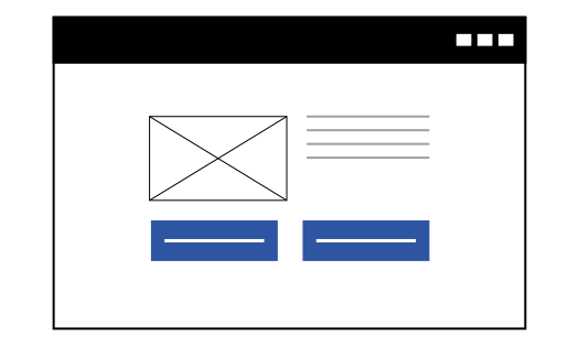
Example: “Buy Now” and “Add to Cart” buttons on an online store are designed large and positioned near product images and descriptions. This reduces the time users need to click, making conversions easier.
Goal-Gradient Effect
The Goal-Gradient Effect indicates that people are more motivated when they are closer to completing a goal. Use progress bars and other visual indicators to show users their progress toward completing a task.

Example: An online learning site that shows visual progress bars for courses encourages students to complete modules. Seeing they’re close to finishing motivates them to continue.
Hick’s Law
Hick’s Law states that the time it takes to make a decision increases with the number and complexity of choices.
Simplify options and organize information logically to make it easier for users to decide.
Example: A subscription service homepage offering three pricing plans (Basic, Standard, Premium) instead of a dozen options simplifies decision-making. Fewer choices help users decide faster and with less effort.

Example: A subscription service homepage offering three pricing plans (Basic, Standard, Premium) instead of a dozen options simplifies decision-making. Fewer choices help users decide faster and with less effort.
Tesler’s Law
Tesler’s Law, or the Law of Conservation of Complexity, states that every application has a certain level of inherent complexity that cannot be reduced.
The key is to transfer complexity to the system, reducing cognitive load on the user. Simplify the user experience without removing essential functionality.
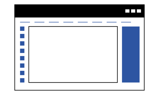
Example: A project management platform hides the complexity of advanced features behind a simplified interface, showing only the most commonly used tools on the main dashboard.
Miller’s Law
Miller’s Law posits that the average number of objects a person can hold in working memory is about seven. In web design, this suggests limiting menu and list options to avoid overwhelming users.

Example: Don’t overload your navigation menu with too many items; prioritize the most important and useful so users can find what they’re looking for without frustration.
Parkinson’s Law
Parkinson’s Law states that “work expands to fill the time available for its completion.” Applied to web design, giving users too much time to complete a task may lead to confusion or loss of motivation. Set clear deadlines and keep tasks simple and well-defined.

Example: A registration process in an app guides users through a short form with a visible estimated completion time. Showing that it only takes a few minutes reduces abandonment rates.
Pareto Principle
The Pareto Principle, or 80/20 rule, suggests that 80% of effects come from 20% of causes. In UX, identify and optimize the features your users use most, as these have the greatest impact on satisfaction.
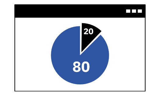
Example: If most traffic lands on the homepage, which also drives the most business return, focus your optimization efforts there.
Zeigarnik Effect
The Zeigarnik Effect states that people remember incomplete or interrupted tasks better than completed ones.
Use this principle to encourage users to finish tasks by providing visual reminders of incomplete progress, such as progress bars.

Example: A to-do site that shows incomplete tasks at the top or uses visual cues like alert icons keeps users aware of pending tasks and motivates completion.
Applying these UX laws to your website design can significantly improve user experience. By understanding and implementing these principles, you can create interfaces that are not only functional but also enjoyable and efficient. Always test and adjust your design based on user feedback and behavior analysis.
